
Eastern Roe
The Project
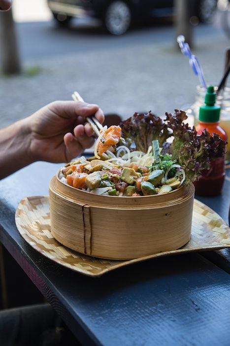
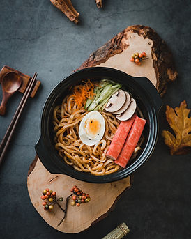
We created Eastern Roe, a proposed food truck based in Charlotte, North Carolina, as our client for this project. Eastern Roe offers both delicious and ethical food choices, however, their main priority is to assist the community - specifically those affected by food insecurity in the wake of COVID-19. For every $10 spent, Eastern Roe will donate the cost of a meal to Feeding America®. Our team’s goal was to create an android application that will provide a means for users to practice social distancing by ordering via the app for pick up and allowing users to actively give back to their communities.


The Team
Our team consisted of UX designers Lexi Wunder and I, visual designer James Spann, and Information Architect Kate Dwyer. The visual designer created the brand style guide, look, feel and worked to bring forth the design elements through our presentations. He also provided us, the UX designers, with deliverables to build into the app design. Lexi and I worked closely together to create the various application wireframes, screens flows and animation features before prototyping for user testing. Our Information Architect provided the team with constructive information for the overall user experience by planning and designing the information structure for our application. She designed strategies using data and research the team conducted. The project manager role was a shared responsibility amongst the team to set goals and priorities. Throughout the course of the project, our roles overlapped, and we assisted in various other roles to help each other with tasks. Having a strong open dialogue of communication was a key part to help this project became successful and produce a finished deliverable. We spent an average amount of 30 hours per week, for meetings, conducting research, prototyping and going over deliverables for each week.
The Process
Our process was a combination of both agile and waterfall frameworks over the course of six weeks. The team met around four times weekly and averaged 20-30 hours per week on each design sprint. We began our process with researching food trucks and like-minded businesses, and screening and interviewing users. We found that users wanted scheduling predictability, efficiency, and safety in their food truck experiences. After researching, we synthesized the information gathered to make informed decisions on the scope, tone, and focus of our application. We utilized personas, journey maps, sketching, scenarios, annotated wireframes and wireflows, prototyping, and iterating to create a streamlined mobile app for foodies who value supporting local business, casual eating, and community. This process led to the Eastern Roe app’s key features: truck locating and scheduling; in-app ordering; ability to choose pickup time; card-scanning; adding a tip; rounding up for an additional donation; Roe Miles loyalty program; and ability to scan receipts to log Roe Miles when not ordered in-app.

Research

Key Takeaways from Interviews
01/
Users want consistency, speed, and predictability in their ordering and overall experience with the food truck
-
57% users stated convenience and speed as being key to their food truck experience
-
Food trucks are unpredictable - hours and location and possibility of lines/limited seating
-
42% wanted electronic capabilities in ordering and payment
02/
Users wanted assurance of cleanliness and safety in regards to service, packaging, and food pick up, especially with Covid19
-
42% participants noted that they would like to change the food truck experience by having unique and safer packaging
03/
It’s important to users to support their community and build relationships with owners
-
57% users stated that they prefer supporting a local business
-
57% participants stated they want to support businesses that are ethical and/or have shared values
The research and interviews emphasized the need for a reliable, safe, and streamlined process to getting their food truck fix. The solutions to the users’ motivations, frustrations, needs, and wants had to be authentic and casual, like a food truck, yet professional and streamlined.

User Persona
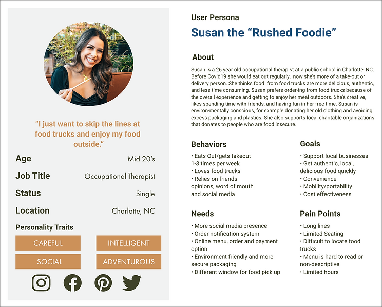
Our design process was very methodical and structured to our research. We created a user persona based on the interviews we conducted. We collected the data and made one cohesive consumer to base our application around. Susan, the rushed foodie was at the forefront of all design decisions. Susan allowed us to view our designs with a focused scope and hone our skills to specific features. Regarding her personality and needs, we set up three scenarios to further our application development.

Design Principles
We based our designs on the following findings for an android food truck application to improve on current food truck experiences found in our initial research and user interviews:

01/
Key finding: Users want consistency, speed, and predictability
-
Simplified/easy to use, playful, casual, and authentic - reflecting the vibe of a food truck
-
Locate truck option with current address, weekly schedule, and monthly schedule. Ability to see estimated distance and use google/android maps to get directions.
-
Food eta (text when order is ready and where to pick up – back window)
02/
Key Finding: Users wanted safer and more unique packaging, especially with Covid19
-
Notification/option for how packaged - area for adding a note for packaging in order process
-
Notification for when order is ready so users do not have to wait next to the truck in a crowd of people.
-
Environmentally friendly packaging - promoted in app on about page
03/
Key Finding: Users want to support local community and build relationships with owners
-
“About Us” section of the app outlining where Eastern Roe sources food and advertise humanitarian aspects
-
Notification of Roe Miles - where user money goes and playful visual demonstration of user/community total donated meals. Rewards for when a user hits 1,000 Roe Miles (10 meals donated).
Visual Design
As we moved onto the visual design process, we sketched out our initial concept for the application. We decided to use an Android operating system since data shows there are more Android users than iPhone users in the United States. The color scheme was created not only to match our branding, but also to accommodate those who may have visual impairments. We wanted our application to be as accessible as possible.

We then got to work on the visuals. Finding a concise way to combine our branding and overall tone that matched the user data was difficult, but we all came together to develop the initial concept. The first home screen we developed was very clean, but it was too tight and cluttered. In addition to spreading it out, we decided to brighten the page with a cleaner header and brighter palette.


User Scenario 1 - Truck Locating
Scenario
Susan has a busy schedule meeting with clients back to back during the day. A fast, nutritious, and satisfying lunch is an important part of her busy day. She opens the Eastern Roe app and sees the Locate Truck banner. She taps on the truck banner to view the current truck address on the map and see her distance from the truck. Just her luck - they’re around the corner today!

User Scenario 2 - Ordering/Self Checkout

Scenario
Susan orders her meal as she gets into her car. It’s important to her that the menu shows all the ingredients since she’s not always sure what comes with each dish. She makes a minor error during check out, but quickly corrects herself. Once she checks out she sees an order confirmation screen and a pop up that she’s hit 1,000 Roe Miles. It eases Susan’s mind to see the confirmation and leaves to pick-up her order.

User Scenario 3 - Check my Roe Miles

Scenario
Susan arrives at the food truck location a few minutes before her pick up time. She sits in her car and opens the app to check her status. While she’s there, she decides to take a look at her Roe Miles, especially since she hit the 1,000 mile mark today! She loves supporting a local business, especially one that gives back to the community.

Journey Map
Those scenarios allowed us to fully focus on our visual development and gave us a foundation for our UX design. Moreover, our journey map gave us insight to what the average consumer would go through as they conduct a food truck order. We established some questions the user would have during the process and used those to direct our design concepts.


Next Steps
The app was created following the screen specifications of the Samsung Galaxy S10 because 56% of Americans use Android, and of those, the S10 was the most popular phone. After completion of the design, our team tested the app and realized that we did not account for the front camera of the Galaxy S10. Unlike its predecessors, the S10’s screen covered the device from edge to edge, leaving a circle cut out in the top right corner. This oversight could be solved by adjusting the height of the notification bar at the top of the screen.
Due to time restrictions, the only feature from our project plan that we did not advance to the final prototype was voice ordering. However, our original user scenarios evolved slightly over the course of the project. For example, we started out with a “buy one, give one” method of donating meals, but reconsidered and created a point system based on the dollar amount spent instead to better account for the wide variety of prices within the menu.
Based on user interviews, we also considered adding another scenario reflecting the most used means of learning about a company and finding food truck locations: social media and word of mouth. Our solution idea was to create the ability to "check in", post a review within the app, or add a catchy reminder to the order confirmation page like "don't forget to share this drool-worthy food on insta and tag us".

Reflection
One thing to note, is that during the initial start of our project we had a fifth member. Over the course of the following weeks, communication issues and priorities of work played a part in creating frustrations within the teams dynamic. Once we fully understood the situation, we were able to address it. Rather than ignoring it and letting it get worse, the team worked to find a solution that worked well for everyone. We spoke to the team member about the problem. Approach the conversation respectfully and did it privately. In the end, we decided as a group to go our sperate ways but remained respectful and open with our team member. This challenging situation taught us all how to be open and clear with one another, as well as setting expectations on responsibilities. We followed seven steps to handle the situation:
1. Acknowledge the problem.
2. Be direct and talk about it.
3. Listen.
4. Come up with a solution for the conflict.
5. Stay professional.
6. Pay attention and follow up.
7. Know when to escalate.

